💡 스토리북의 디자인시스템 튜토리얼을 진행하고 오시는 것을 추천합니다.
튜토리얼을 진행하고 오셨다면 예제로 사용할 소스코드가 있을 것입니다. 해당 코드들 위에서 아주 간단한 Input 컴포넌트를 타입스크립트로 작성하고 Rollup으로 빌드하도록 하겠습니다.
01. Typescript 셋팅하기 (tsconfig)
먼저 타입스크립트 패키지를 설치합니다.
npm install -D typescript
tsconfig.json 파일을 루트에 생성합니다.
// tsconfig.json
{
	"target": "ES5",
    "lib": [
        "DOM",
        "DOM.Iterable",
        "ESNext"
    ],
	"jsx": "react-jsx",
    "jsxImportSource": "@emotion/react",
    "module": "ESNext",
    "moduleResolution": "Node",

    "declaration": true,
    "declarationDir": "dist/@types",
    "sourceMap": true,
    "esModuleInterop": true,
    "forceConsistentCasingInFileNames": true,
    "strict": true,
    "skipLibCheck": true
}
특히 "declaration": true로 라이브러리 빌드 시 *.d.ts 파일을 생성해주며, "declarationDir": "dist/@types"는 빌드폴더의 @types안에 *.d.ts 파일들을 위치시키도록 합니다. 더 자세한 설정은 공식문서를 참조하시면 좋습니다.
이제 js로 되어있는 파일을 ts로 변경해주면서 점진적으로 적용해보겠습니다.
02. 글로벌 스타일을 타입스크립트로 변경하기
1). src/shared/global.js 파일을 global.ts로 변경합니다.
2) 타입에러가 발생되는 파일을 찾아서 타입에 맞도록 수정합니다.
3) .storybook/preview.jsx 파일을 찾아 preview.tsx 파일로 변경하고 다음과 같이 코드를 수정합니다.
import { Global, ThemeProvider } from '@emotion/react'
import { GlobalStyle } from '../src/shared/global'
import { Preview } from '@storybook/react'
import React from 'react'

const preview: Preview = {
    decorators: [
        (Story) => (
            <>
                <Global styles={GlobalStyle} />
                <Story />
            </>
        ),
    ],
    parameters: {
        actions: { argTypesRegex: '^on[A-Z].*' },
        controls: {
            matchers: {
                color: /(background|color)$/i,
                date: /Date$/,
            },
        },
    },
}

export default preview
03. Input 컴포넌트 만들기
src/Input 폴더를 생성하고 index.ts, input.tsx, input.stories.tsx 파일들을 만듭니다.
index.ts: input.tsx를 export 해줍니다.
export * from './Input'
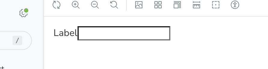
input.tsx: 인풋 컴포넌트를 생성합니다. 여기에서는 간단하게 라벨이 있는 인풋과 없는 인풋의 케이스만 고려하여 생성하겠습니다.
Input에 Props로 label의 값을 건네주지 않으면 label이 없는 인풋이 렌더링될 것입니다.
import styled from '@emotion/styled'
import { InputHTMLAttributes, forwardRef } from 'react'

export type InputProps = InputHTMLAttributes<HTMLInputElement> & {
    label?: string
}

const StyledInputWrap = styled.label`
    span {
    }

    input {
        background-color: white;
        color: blue;

        &:focus {
            background-color: red;
        }
    }
`

export const Input = forwardRef<HTMLInputElement, InputProps>((props, ref) => {
    return (
        <StyledInputWrap>
            {props.label && <span>{props.label}</span>}
            <input id='input' type='text' ref={ref} {...props} />
        </StyledInputWrap>
    )
})
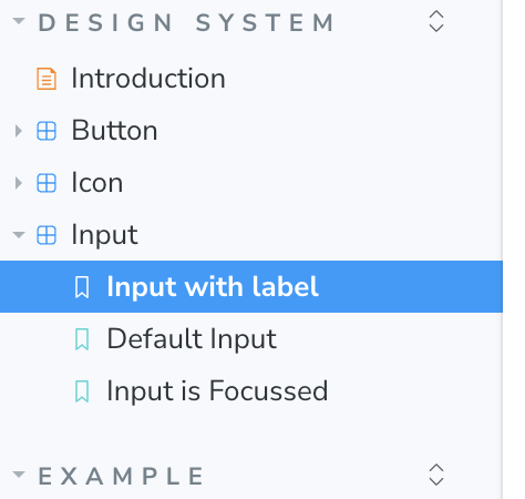
04. Input 컴포넌트 스토리 만들기
라벨이 있는 인풋, 없는 인풋, 포커스된 인풋 세가지 케이스의 스토리를 구성해보겠습니다.
import { Meta, StoryObj } from '@storybook/react'
import { Input } from './Input'
import React from 'react'
import { findByRole, fireEvent, within } from '@storybook/testing-library'
import { expect } from '@storybook/jest'

export default {
    title: 'Design System/Input',
    component: Input,
    args: {
        'aria-label': 'Input',
    },
} as Meta<typeof Input>

type Story = StoryObj<typeof Input>

export const InputWithLabel: Story = {
    name: 'Input with label',
    args: {
        label: 'Label',
    },
}

export const DefaultInput: Story = {
    name: 'Default Input',
}

export const InputFocus: Story = {
    name: 'Input is Focussed',
}
스토리북을 실행하면 다음과 같이 Input을 확인하실 수 있습니다.
이렇게 타입스크립트로 새로운 컴포넌트를 만들고 스토리북에서 제대로 렌더링 되었는지 확인까지 마쳤습니다. 이제 해당 컴포넌트를 다른 프로젝트에서도 사용할 수 있도록 배포하기 전 빌드하는 과정을 살펴보겠습니다.
05. 빌드 셋팅하기 (Rollup, package.json, tsconfig)
ES모듈로 빌드가 가능하며 Tree shaking에 유리한 Rollup 번들러를 사용해서 라이브러리를 빌드해보겠습니다. 스토리북의 튜토리얼로 시작하셨다면 rollup.config.mjs가 있을텐데요. 없다면 Rollup을 설치하고 루트경로에 파일을 생생해주시면 되겠습니다.
rollup.config.mjs
사용하는 프로젝트가 commonjs를 사용하던, es6이건 상관없이 라이브러리 소스코드를 활용할 수 있도록 'cjs'와 'esm' 두개의 포맷으로 빌드하도록 하겠습니다.
특히 plugins에 플러그인을 집어넣을때 순서를 유의해야하는데요. typescript의 경우는 ts파일을 js 파일로 트랜스컴파일하기 때문에 babel 플러그인이 정상적으로 완성된 js파일을 트랜스컴파일 할 수 있도록 항상 babel보다 앞쪽 순서에 넣어주도록 합니다.
import resolve from '@rollup/plugin-node-resolve'
import commonjs from '@rollup/plugin-commonjs'
import terser from '@rollup/plugin-terser'
import peerDepsExternal from 'rollup-plugin-peer-deps-external'
import { babel } from '@rollup/plugin-babel'
import typescript from '@rollup/plugin-typescript'

import { createRequire } from 'node:module'
const requireFile = createRequire(import.meta.url)
const packageJson = requireFile('./package.json')

export default [
    {
        input: 'src/index.ts',
        output: [
            {
                file: packageJson.main,
                format: 'cjs',
                sourcemap: true,
            },
            {
                file: packageJson.module,
                format: 'esm',
                exports: 'named',
                sourcemap: true,
            },
        ],
        plugins: [
            peerDepsExternal(),
            resolve({
                extensions: ['.js', '.jsx', '.ts', '.tsx'],
            }),
            commonjs(),
            terser(),
            typescript(),
            babel({
                extensions: ['.js', '.jsx', '.ts', '.tsx'],
                exclude: 'node_modules/**',
                babelHelpers: 'bundled',
            }),
        ],
        external: ['react', 'react-dom', '@emotion/react', '@emotion/styled'],
    },
]
06. 빌드하기
Rollup으로 빌드하기 위해 package.json 파일의 빌드 스크립트를 변경해주도록 하겠습니다.
{
	...
    "scripts": {
    	"build": "rollup -c"
    }
    ...
 }
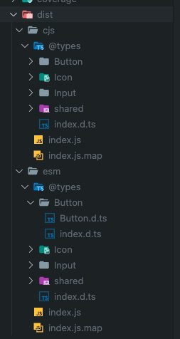
npm run build로 빌드를 실행하고 나면 dist폴더에 cjs와 esm 빌드 결과물을 확인하실 수 있습니다. 이제 빌드된 파일을 배포하기만 하면 원하는 프로젝트에서 로드하여 프로젝트를 시작할 수 있게 됩니다.
다음 포스트에서는 빌드된 결과물을 배포하는 두가지 방법에 대해서 말씀드리겠습니다.
하나는 모든 사람들이 접근할 수 있도록 오픈소스로 배포하는 방법, 또 다른 하나는 회사내에서 또는 권한이 있는 사람만 접근할 수 있도록 Private 배포 하는 방법이 있겠습니다.
'Projects' 카테고리의 다른 글
| [UI 컴포넌트 라이브러리] 2. 라이브러리 배포하고 사용하기 (NPM, Github Packages, Docker) (1) | 2023.09.02 |
|---|---|
| [UI 컴포넌트 라이브러리] 0. 디자인 시스템, Storybook (0) | 2023.08.15 |